Posted in News on Sep 23, 2002.
1. The design was put together by a team of people from both SuperSport Zone and Kaizer Chiefs who undertook extensive research into other International Team websites eg: Marseille, Liverpool, Manchester United and Juventus. Once all the elements were put together it was presented to a panel of experts in the field of on-line communication who all unanimously gave it the thumbs up in terms of design and freshness versus the old one that had remained the same for almost two years.
2. The font on the site is 'INTERSTATE' which is Kaizer Chiefs official typeface. Anyone who has any Chiefs correspondence will tell you that all Kaizer Chiefs correspondence is in this font including our magazine 'Amakhosi'.
3. The Colour on the site is as per our brand identity guidelines. All stationery, business cards letterheads etc. all portray the same colour. The playing jerseys are very close to this colour unfortunately they do not reflect that way photographically.
4. The white background is a way of effectively speeding up the website as it requires less bandwidth and thus makes it quicker to open and also much easier to read.
5. The current site is more interactive in terms of polling systems and the live chatroom.
6. There is a interesting looking movement on the home page making the site more modern in keeping with International trends.
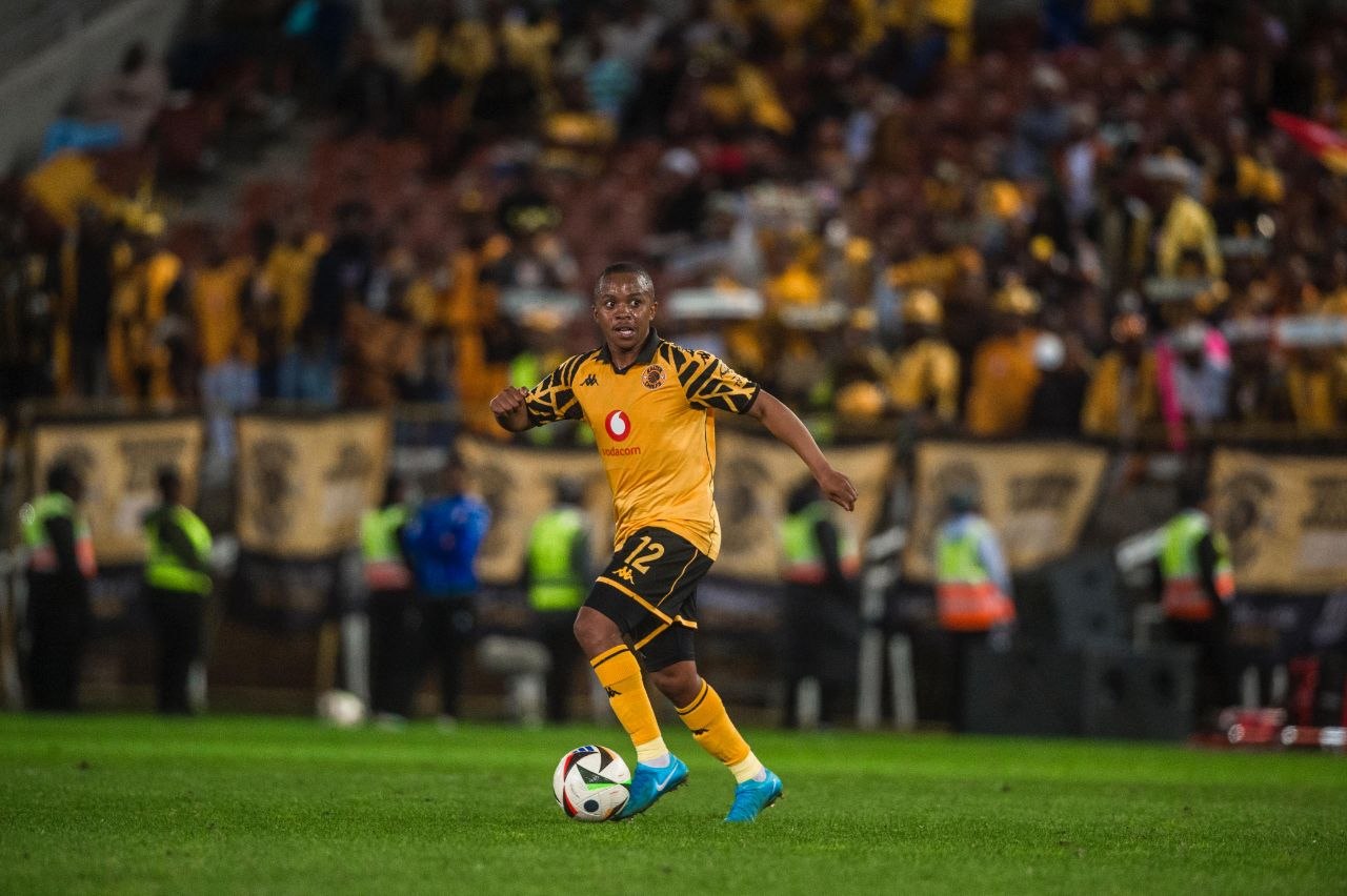
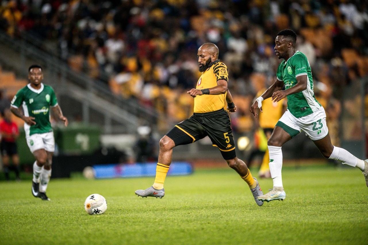
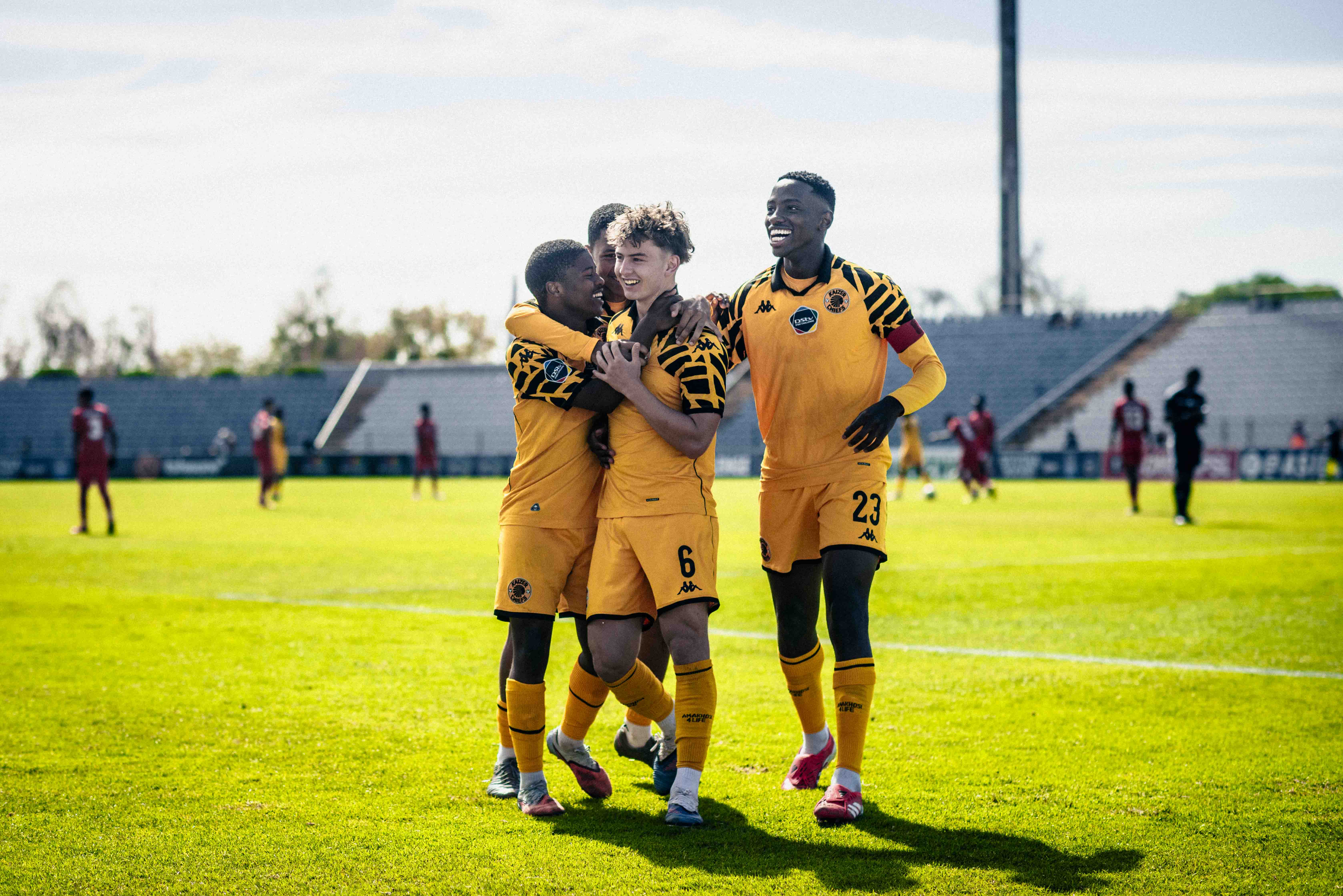
7. The photos are new giving the site a fresh look.
8. The logo is animated and makes the whole look and feel of the brand more interactive.


